ITAS Assicurazione
S E R V I C E D E S I G N & U X / U I D E S I G N
Background
ITAS Assicurazione came to Imille to ask for a redesign for their website. The platform had been online already for several years and they wanted a more professional representation of the brand, to change the graphic interface to make it look modern, but above all, they were presenting many issues when it came to the organization of it, since the users where getting the wrong information. They wanted to know if the flows to get to the different products and client service were correct, because during the years the rate of people calling or writing to the wrong channel or service were very high.
After having a clear task coming from them we needed to define our work plan, since ITAS was very open to work with us we wanted to go more in depth into the knowledge of the company and really know who they are, what were their pain points and also the strengths that define them and made them one of the best insurance company in Italy. Our steps to follow were:
Our plan
- Interviews to the managing director and the commercial direction.
- Workshop with the team of ITAS to find the most effective and appropriate language to communicate ITAS to the public
- Interview the Executive directors from the sustainability area which was a part that the company had mentioned us, wanted to highlight more.
- Interview to the product team area in order to find what is the perception of the products offered by ITAS and how they are currently presented on the platform compared to competitors
- Focus group with the team of client support in order to understand ITAS's current support system and highlight its strengths or weaknesses. Additionally find out their expectations in the future support section.
My participation in the plan
I participated in the creation of all the workshops and the support of them with my boss and two other colleagues from Imille. Here a further explanation
- Workshop with the team of ITAS to find the most effective and appropriate language to communicate ITAS to the public
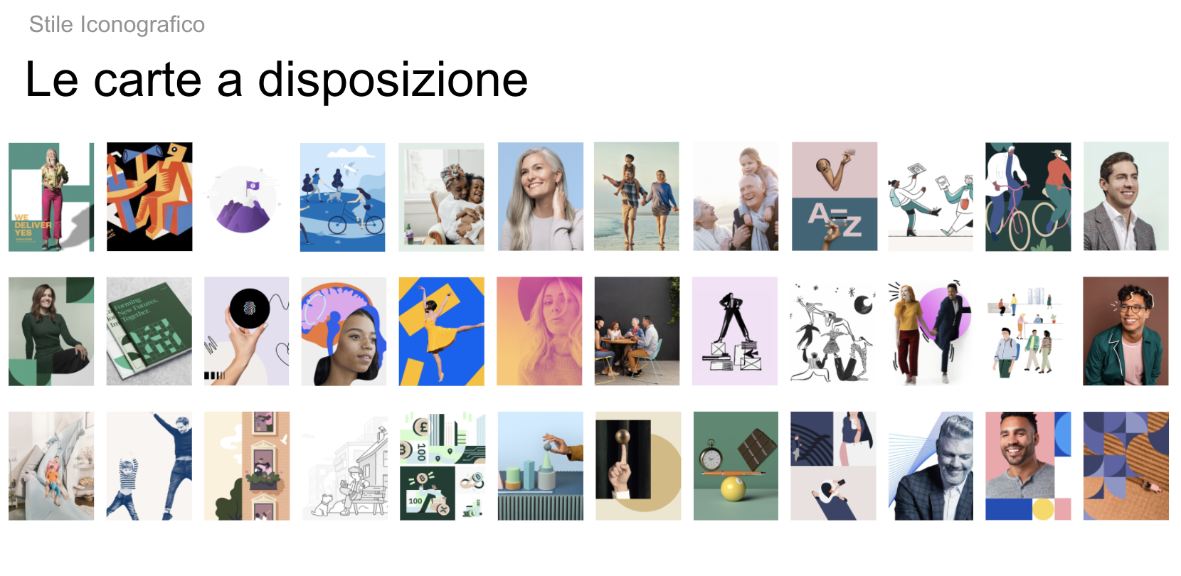
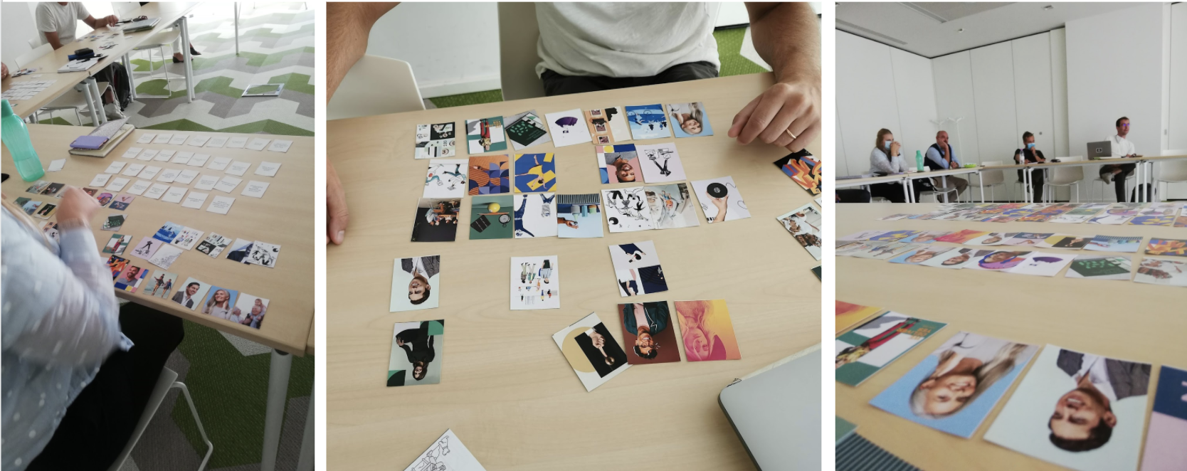
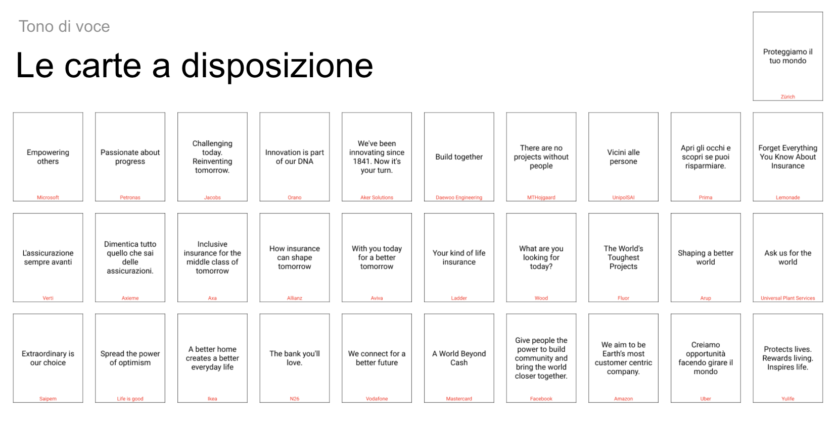
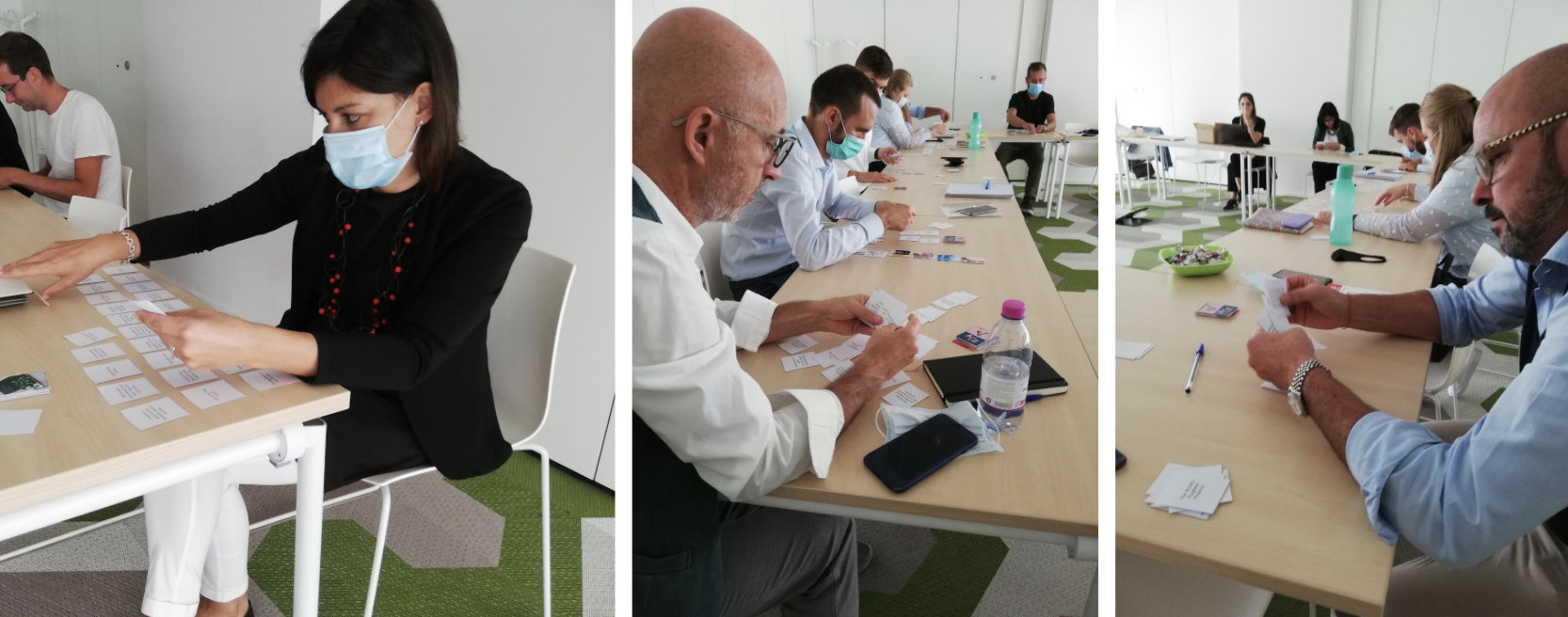
In order to figure out the brand, two card sorting exercises were conducted, one on iconographic style and the other on tone of voice.
Each of the 9 participants was given two decks of cards, which they had to sort from the most representative card to the least representative of the communication style that ITAS should embody.
Iconographic Style
REMARKS
-
Most of the images chosen include multiple people interacting with each other, primarily families.
-
Photographs with a specific treatment were often chosen
-
The idea of community is important and can generate a sense of belonging among both employees and policyholders.
Tone of voice
REMARKS
-
Idea of closeness and relationship.
-
ITAS thinks about people, how to create and evolve together.
-
None of the top-rated slogans talk about insurance.
INPUT
For ITAS, at the base of everything there are its customers and the relationships that are created with them.
Attention to its customers is considered the company's strong point, and the value that is worth transmitting to the public.
ITAS, in Trentino, is still seen as an institution before being an insurance company.
2. Focus group with the team of client support in order to understand ITAS's current support system and highlight its strengths or weaknesses. Additionally find out their expectations in the future support section. I participated in this focus group as part of the support team taking notes and following the process.
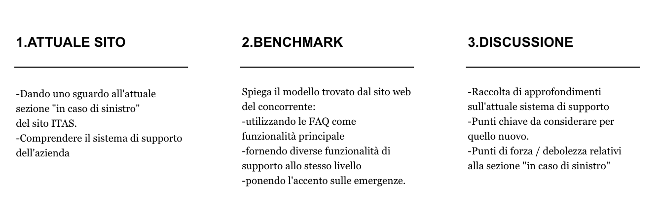
Our goal? Understand ITAS's current support system and highlight its strengths or weaknesses.
Find out their expectations in the future support section.
With the 3 participants, we had a focus group session focused on 3 sections: discovering the current support section on the ITAS website, benchmarking competing companies' approach to support, and in-depth discussion of the current system, understanding expectations from the new support section.
KEY POINTS
-
Clarity in definitions of product type, claims, documents, etc. Without becoming an encyclopedia
-
Clear description of the steps the client must take during a claim and the documents they may need
-
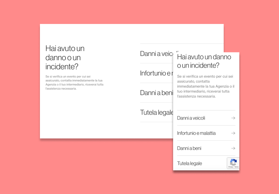
Organize claim cases according to their importance and isolate cases with immediate emergency management.
-
Clearly distinguish between different support numbers
-
A support section that offers possibilities both for users who have had a claim or want to have information on the evolution of their claim.
After the 3 days dedicated to workshops, interviews and focus groups we took the insights and began to work on the general benchmark for the interface of the platform and it’s language.
We worked analizing all the different sections of the platform and working as team, me, another ux/ui designer and the leader of the project. We had a constant communication and reviews with the team of ITAS in order to know their thoughts and how to improve the site.
Aditionaly we created an entire design system, from atoms to components in order to make the website adaptable to any change that they want to add in the future.
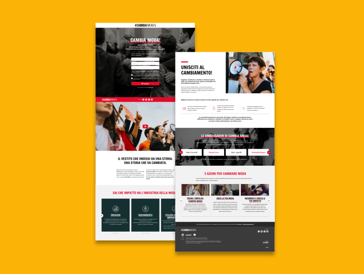
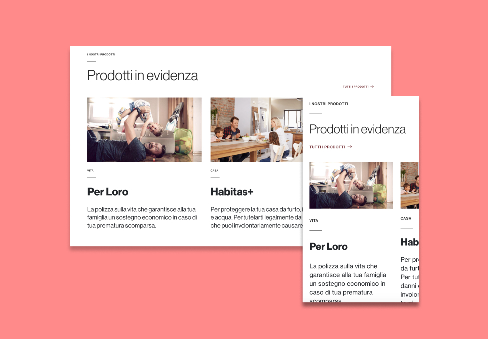
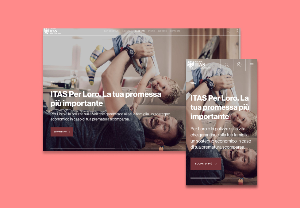
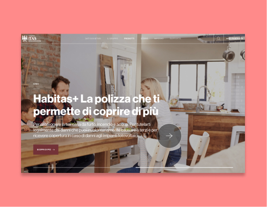
Here a few examples of the final product.
Details
-
Client:
ITAS Assicurazione -
Objective:
Develop the new official website for the company -
Role:
Service and UX/UI designer
ITAS It is Italy's oldest mutual insurance company, founded in 1821 in what was then Austrian Trentino. In 2019, ITAS has about one million insured members.
