Creativity for Enel Loyalty
U X / U I D E S I G N
Enel Energia
Enel S.p.A. is an Italian multinational energy company and one of the main global integrated operators in the electricity and gas sectors.
DEM Redesign
For this particular project we were asked to make a redesign of the DEM that every week is sent to the users subscribed to the Loyalty program of Enel Energia in Italy. The main reason was that the entire identity of the Loyalty had changed, new partners had been added and Enel felt that there could be a better way to show the users the offers they had for them.
Analisis
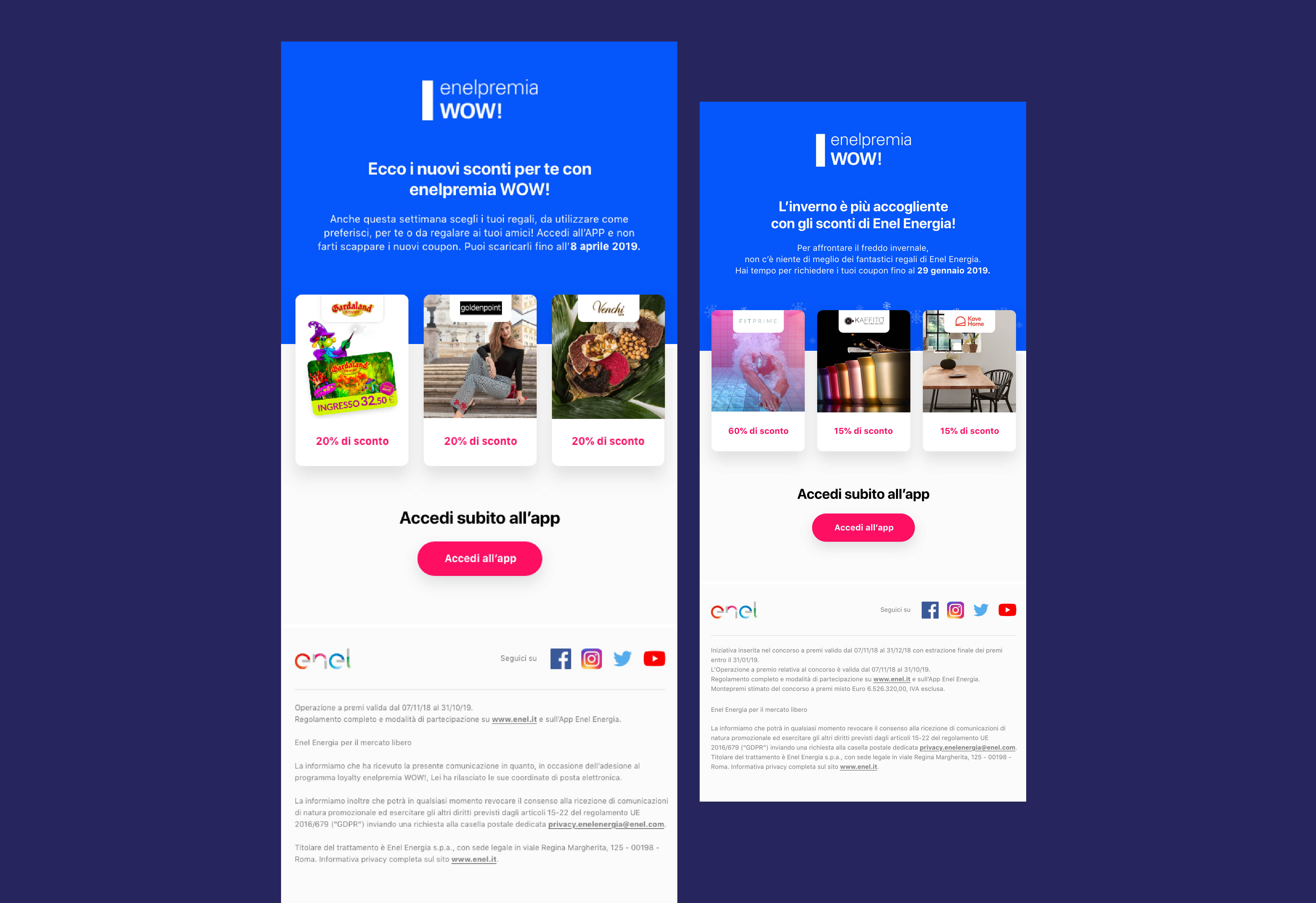
To start, since they asked to redesign the DEM we needed to analyse how the actual DEM at the moment was design, what was missing, what could change and how we could do it.
What we noticed was:
-
1. Colors
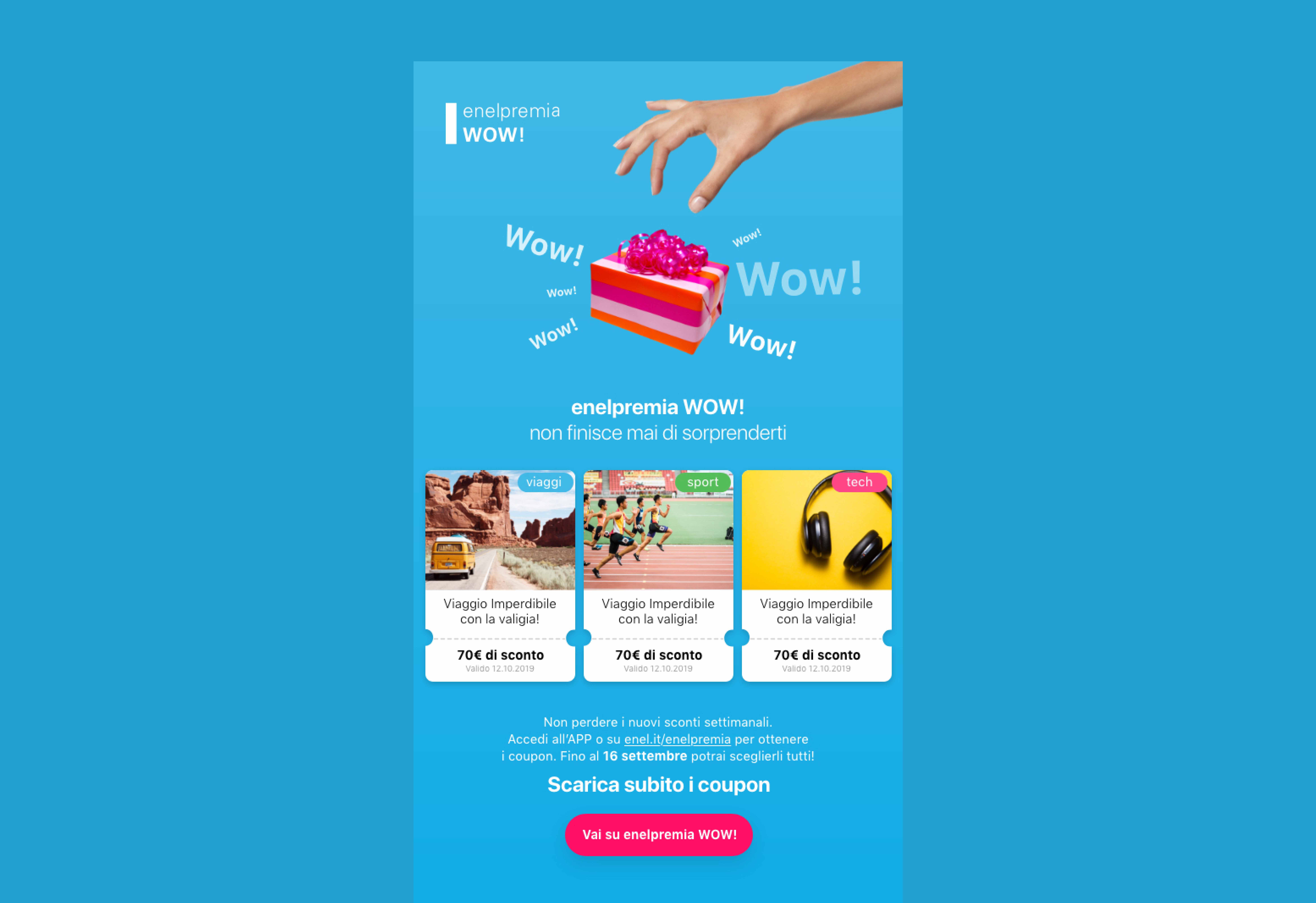
The loyalty program lately had been using more in depth the colors orange and fucsia for their communications, the color blue, the one used at the moment for the DEM appeared to be a secondary in the Loyalty program.
-
2. Partners
The Loyalty program had acquired so many partners in the last year and in so many different areas, that probably it was good to provide the user and the client, some kind of differentiation on what category the partners were becoming part.
-
3. Design
The design itself was flat and did not projected the enthusiasm that Enel Loyalty wanted for the user.
Design
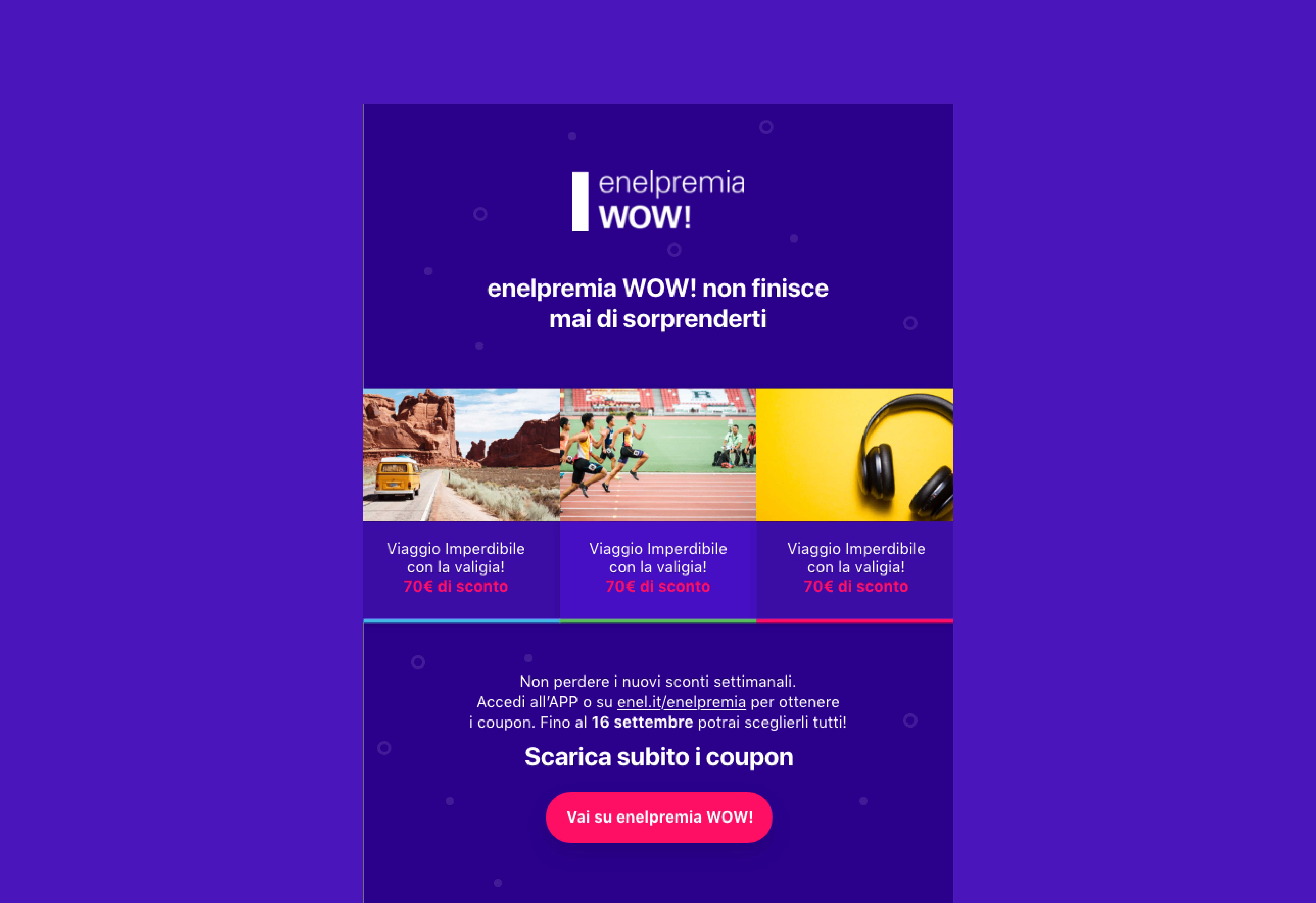
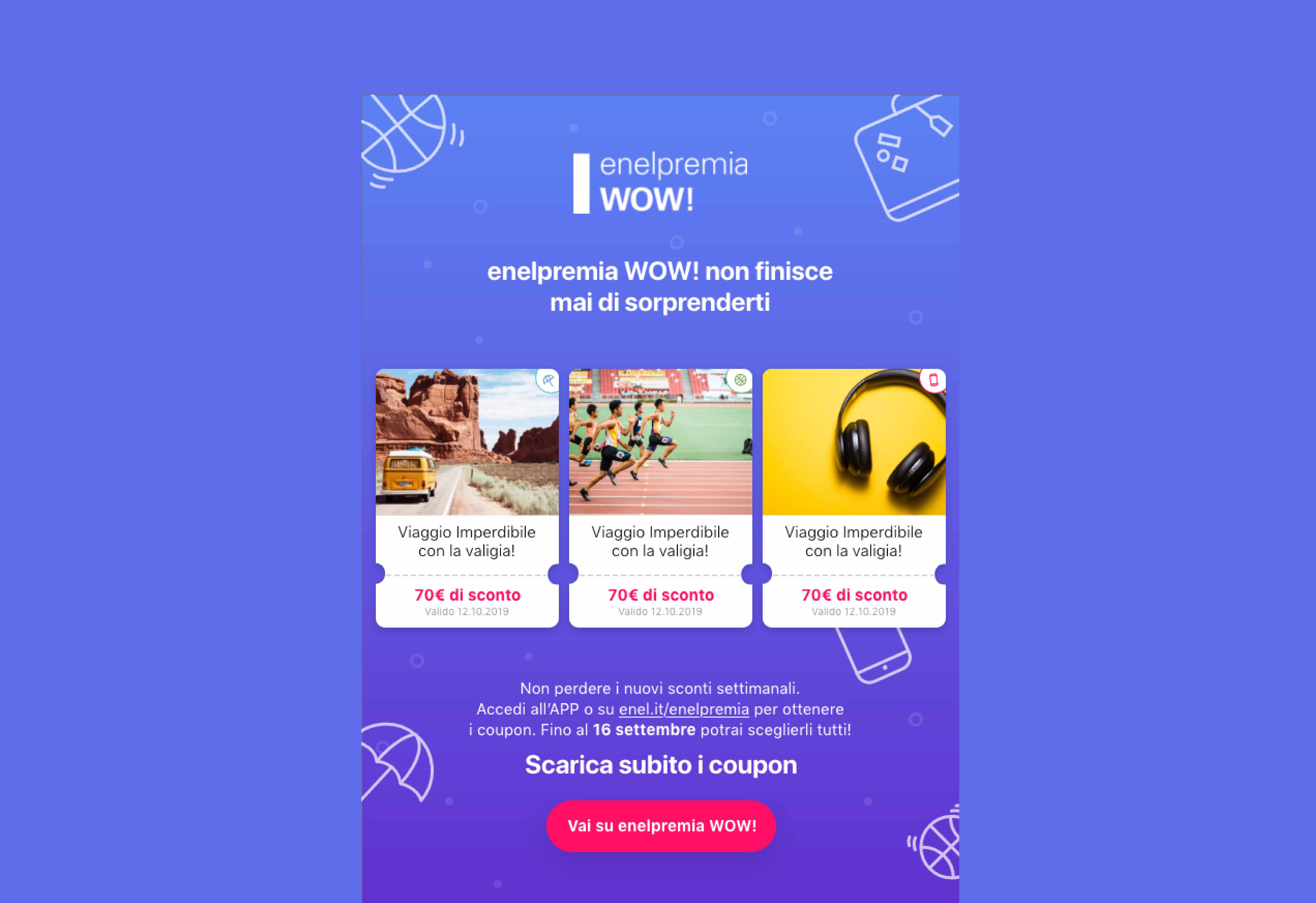
Keeping into consideration this insights we started to design and explore different possibilities taking into account the branding of the company and what they wanted to provide to the users with this project. Here are some of the explorations made:
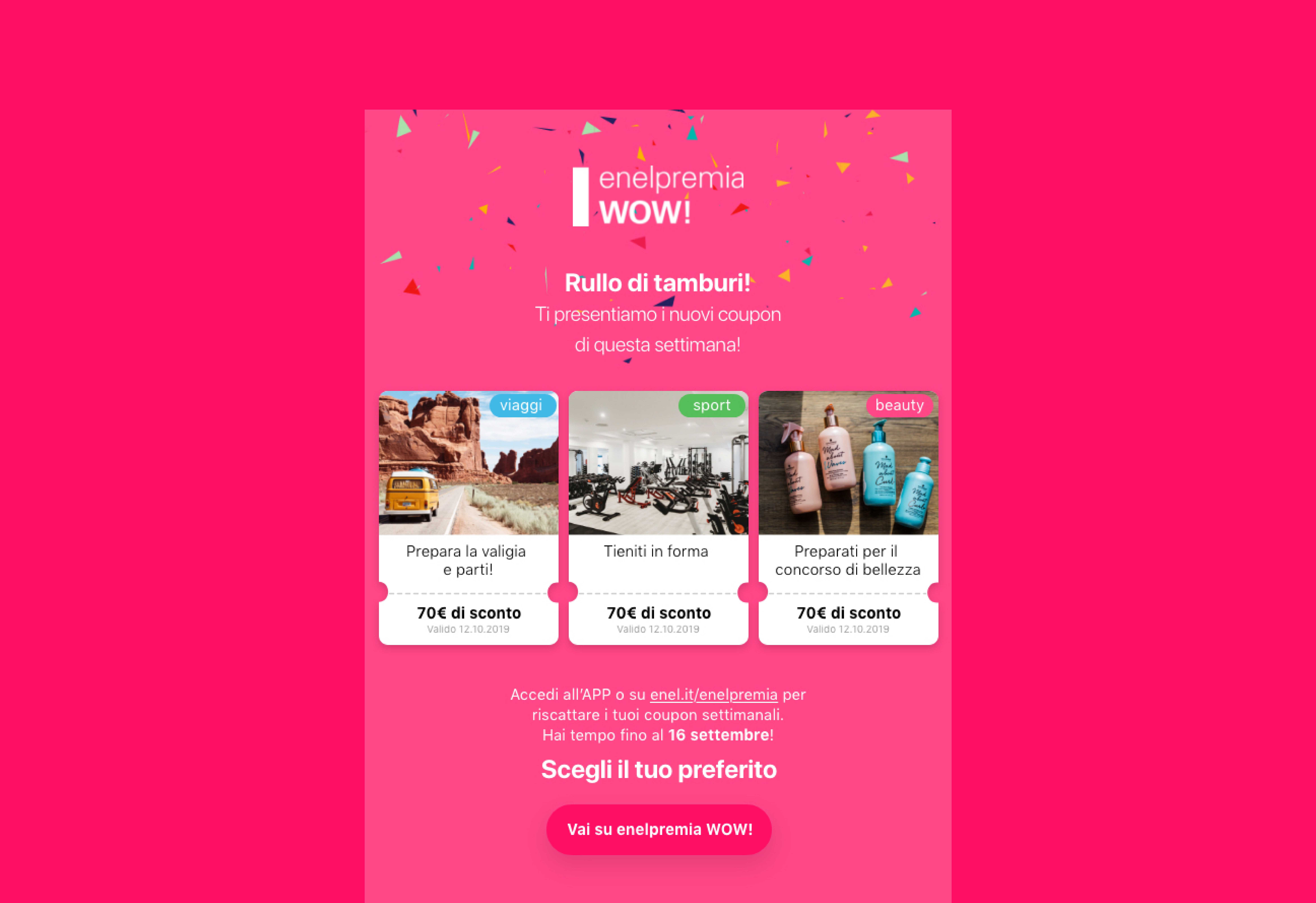
Final result
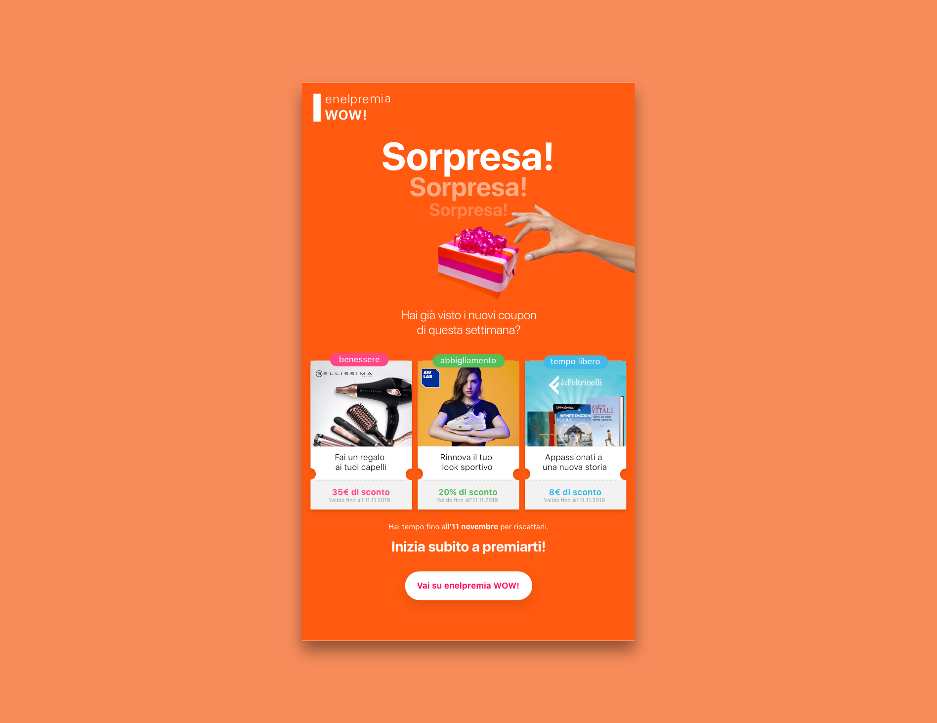
After all the explorations we had a talk with the team of Enel Loyalty and showed the most interesting proposals for them to give us feedback in order to give them the best possible result. The insighst given by them were:
-
1. Gift package
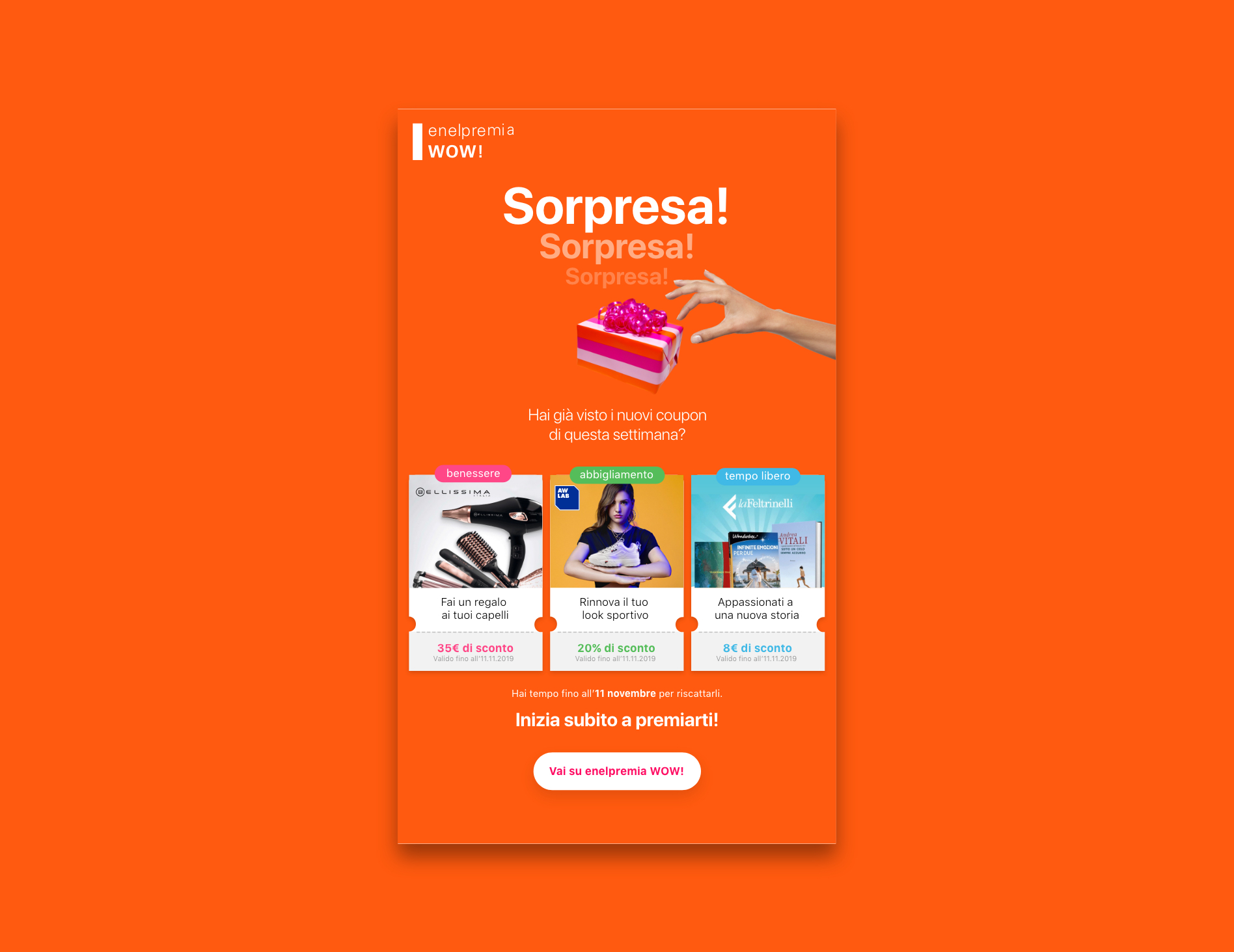
They liked the idea of having a gift package at the beggining of the DEM, they felt that it gave the idea of surprise.
-
2. Coupons
Since what we were giving to the user were different coupons they liked the idea of having all the possible cards designed like this, give a more realistic approach to the promotions.
-
3. Colors
They prefered a solid color not a gradient for this type of communications in order to follow the branding of the company.
-
4. Description
They liked that we made a description also of what the user could win with each coupon.
-
5. Categorization
Finally the categorization of the different coupons was a very appreciated proposal since it made it easier for them as company and to the user to notice all the coupons and keep track of them.
Details
-
Client:
Enel Energia -
Objective:
Design of the new DEM’s that the users receive weekly with different promotions and the design all the interactions for the Loyalty program of Enel Energia -
Role:
UX & UI Designer -
Work done in:
Imille Agency
Enel S.p.A. is an Italian multinational energy company and one of the main global integrated operators in the electricity and gas sectors.
