Esri Colombia
U X / U I D E S I G N
The Problem
Esri Colombia is the leading company in Geographic Information Systems in the country. The creators of ArcGIS, a powerful mapping and analysis software. And they came to us ( Damappa ) the company that I worked at that moment, with the whole idea of redesigning the entire website, since it did not have a similar look among all the pages and there was always more and more Information coming, that they needed to be placed as soon as possible in the platform.
In addition to this, the current website had a large amount of information that wasn't updated or wasn't properly designed for the users to read it. The information wasn't being noticed and neither prioritized, so we were hired to improve the user experience and the interface of the entire website.
Every week new content arrived and new sections had to be added to the Website. It was my job to read the brief from the client, understand what the client expected, develop the UX/UI of the section of the website and work with the developer to develop it in the best way possible.
The major issues at the moment were:
-
1. Target Audience has this frustration
The users can't find the information that they are looking for and the client does not know how to display it in a correct way.
-
2. Target Audience wants to solve this problem
The users want the possibility to understand the website and not divagate from one page to another and the client wants to be able to provide to the user the necessary amount of Information in a clear and precise way.
-
3. Existent solutions are broken or nonexistent
It is necessary a redesign of the user experience that is offered in this platform.
How
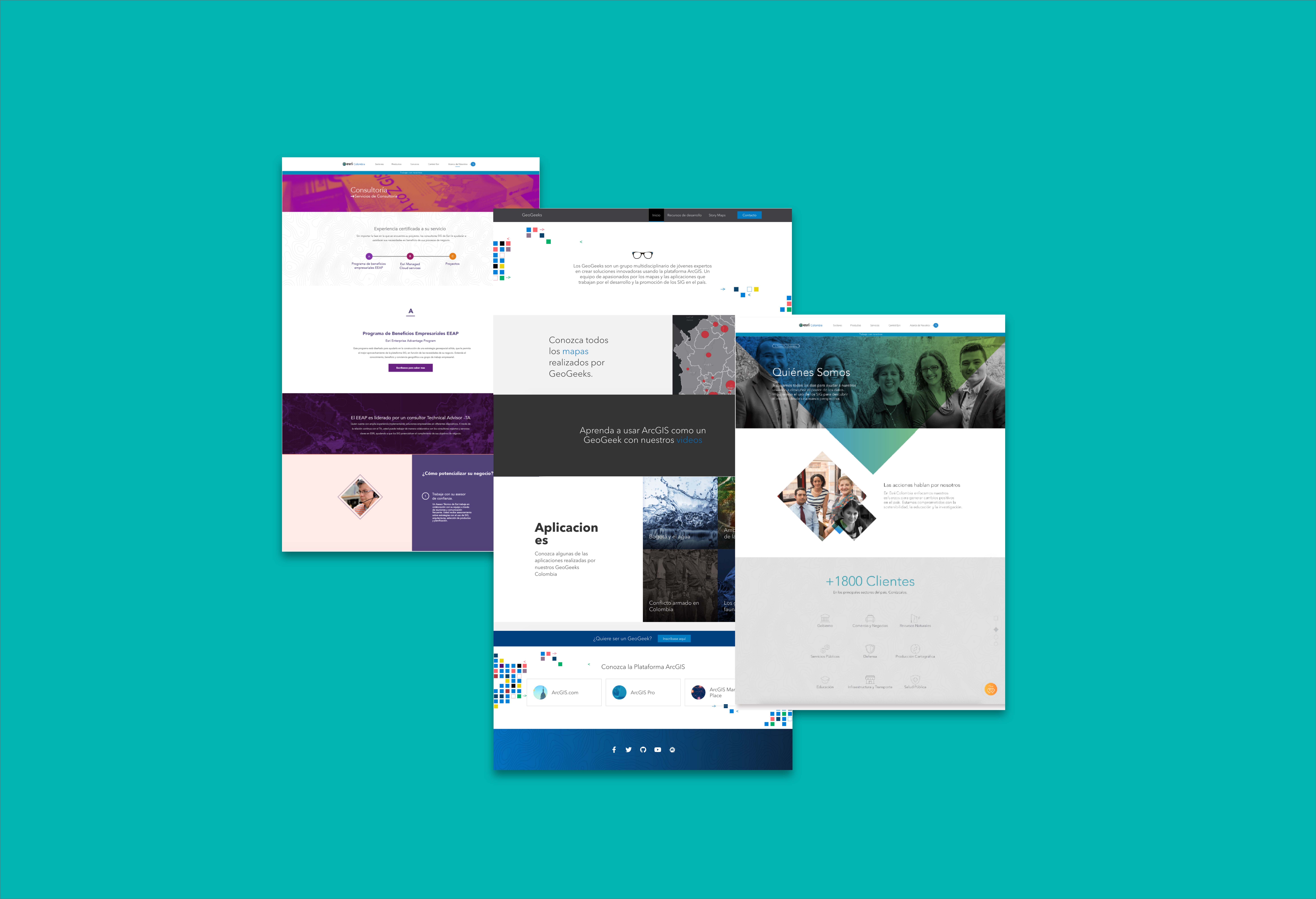
But how did we get to the final design and idea of the redesign. First we had a conversation with the Leaders team of Esri, at the beggining we wanted to make an entire redesign and then go public with it but the discussion with the team lead us to believe that it was best to start changing section by section since every month new content would arrive and it would be impossible to keep up and go live with the final result. Esri also mentioned not being pressured with time, they wanted a quality design and they were aware that they would hire us as consultante for as long as they needed so time was not an issue.
This changed things for us in Damappa, we had to accomodate to the idea that we would not only receive every week new content to post but also start doing the redesign in different pages. I started to manage the Calendar with the developer that was part of the team for this project and clear a whole idea of how we would procede.
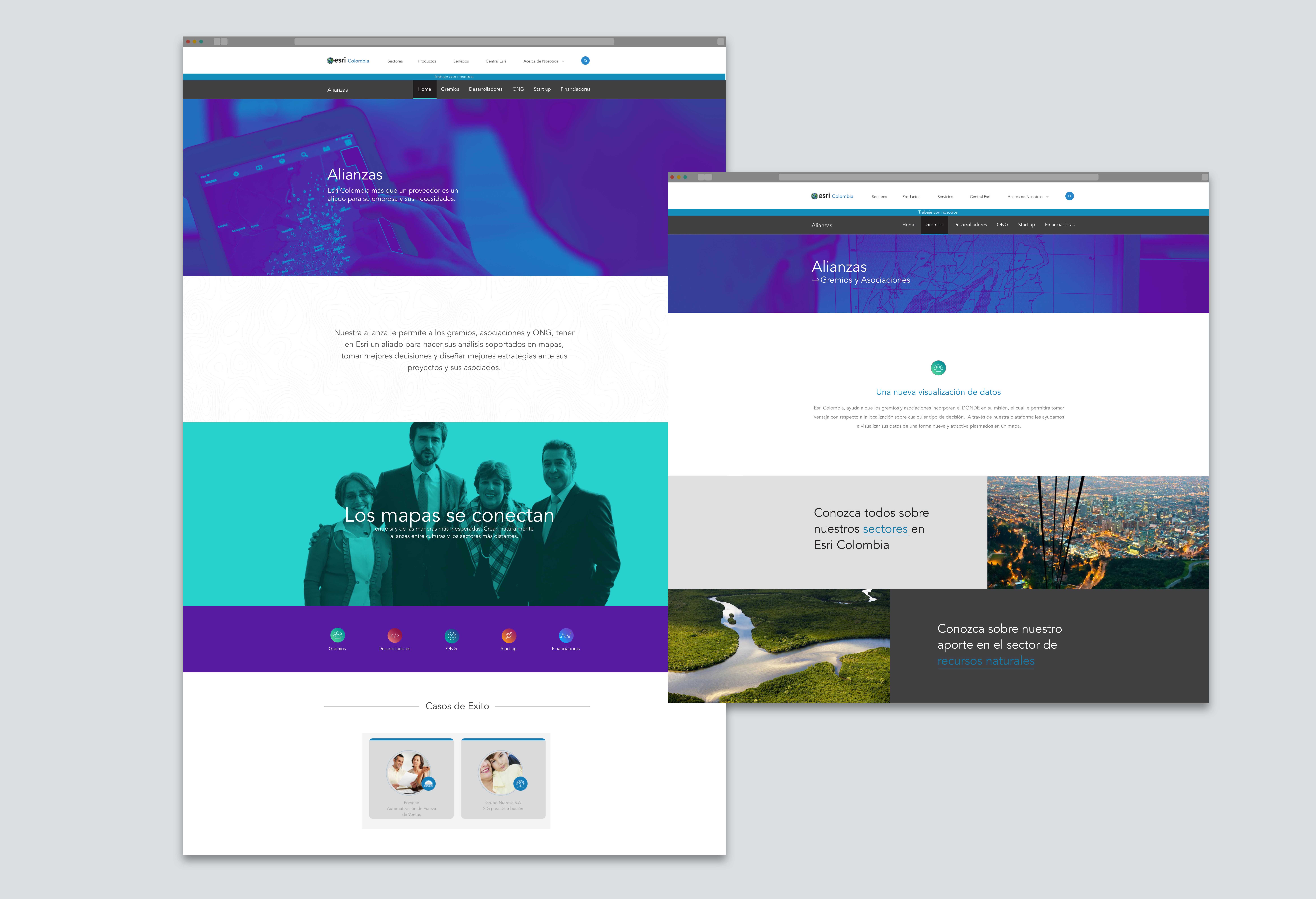
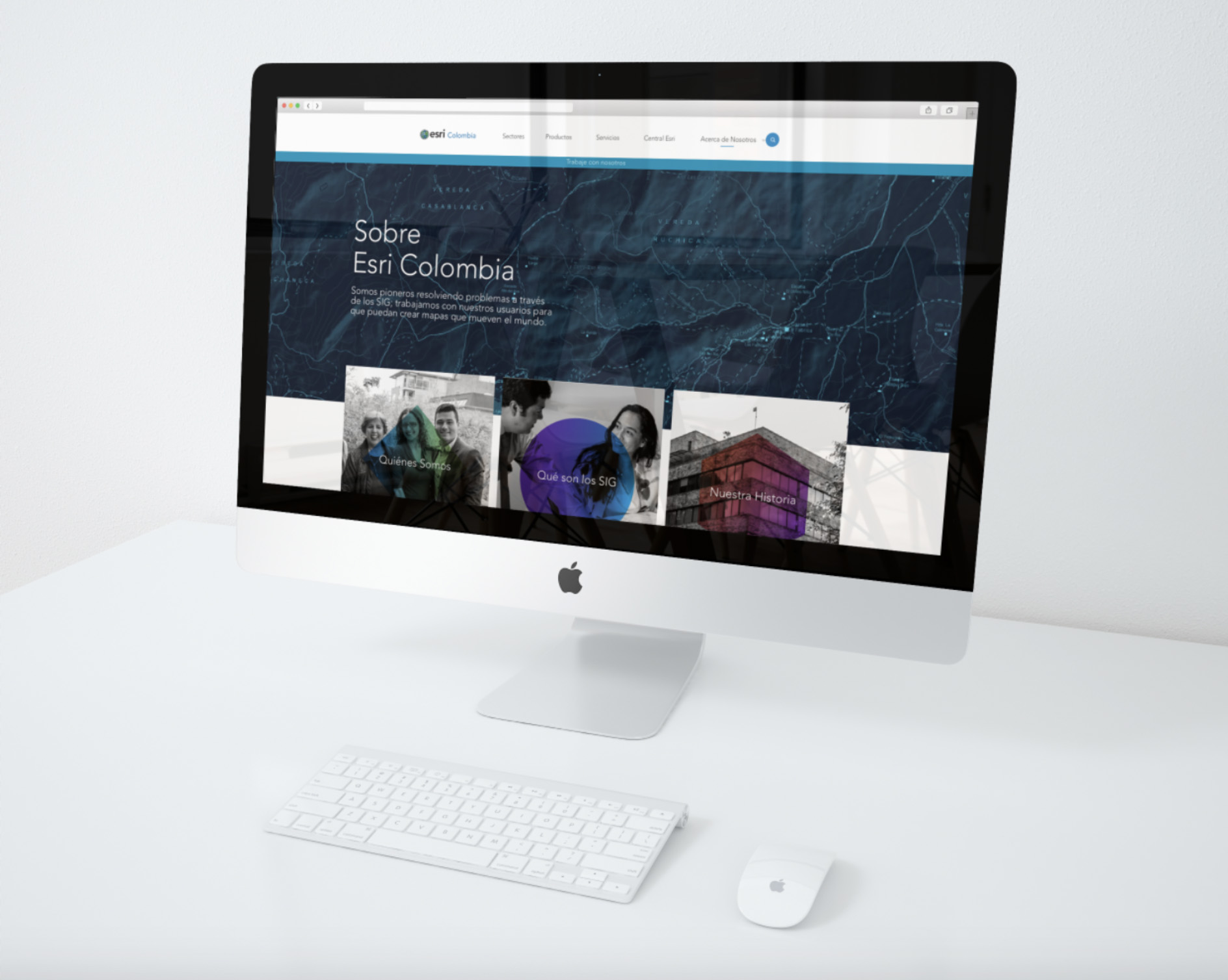
Because of analytics we knew which were the sections that were visited the most so we started with those ones (Home, Who We Are and the products offered ) and adapted the new content to the new Visual and a better user experience.
Challenges
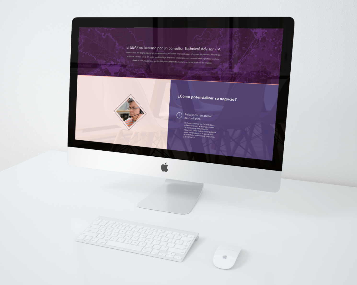
1. I believe that the first challenge that we had with this website redesign was to understand as a team, that the amount of information was so big and different, that it was impossible at the moment to create a redesign for all the sections and screens. To get to this point it was necessary not only to discuss it among us but also with the client and understand their priorities.
2. Another challenge faced during the entire redesign was that so many designers had been part of the project and had graphic styles so diverse, that was necessary to check the principal Esri, which is USA and the latest changes they made, in order to create a more balanced design. For the design System at that moment, I decided to collect all the possible components and gathered them in a single file so this could be used in the future by the others and be more organized.
3. The third challenge that I faced I have to say was working so upclose with a developer, this was my first long job in the ux/ui Field and I had never had to talk so much with a developer, understand the dynamic and way of thinking of an engineer, this really made me grow, understand how to talk with them, speak their language and make the transition of from and back end easier for them.
4. I would say that the final challenge was to really understand the product and service that Esri was offering, since it was so big it really needed to be taken into considerato because it wasn’t good to just keep creating and creating all the content that they were sending on the briefs, the Information could be grouped, could be linked in a different way, like this the menu was reduce, pages of products and sections were connected, linked and in some cases merged.
Details
-
Client:
Esri Colombia -
Objective:
Website redesign -
Role:
Product designer
Esri Colombia works with the science of geography and GIS technology brought together. The Science of Where transforms the world by unlocking the full potential of data within organizations everywhere. All under the belief that our users create the maps that make the world run.
